Showing posts with label Branding. Show all posts

Monday, November 26, 2012

Cartier's Epic Old World Luxury Storytelling Tactic Is Being Copied and Ruined

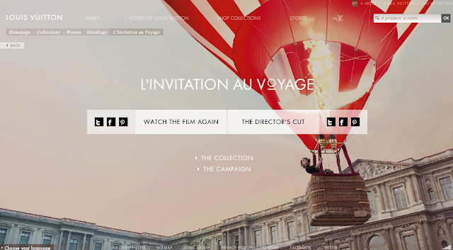
I recently noticed that Louis Vuitton's first TV commercial L'Invitation Au Voyage featuring a hot air balloon in Paris and Burberry's holiday gift campaign of gold balloons carrying presents across London landmarks reminded me a lot of Cartier's L'Odyssée campaign which premiered earlier this year in March with an epic 3:30 TV spot during prime time television.

It's clear just by looking at the websites for Louis Vuitton and Burberry that these efforts were influenced by Cartier's L'Odyssée:
Perhaps Louis Vuitton and Burberry hired Cartier's Creative Director, and that Creative Director had some spare time to work on a Martini & Rossi commercial as well (watch the last video in the post). Is the luxury and cheap champagne industry quickly losing its creative edge and identity by jumping on the latest and greatest shiny object of Golden Compass-like fantasy storytelling--a blend of old world with new attitude and lots of floating/levitation? I'll give Cartier credit for shattering the expectations of Luxury advertising and for throwing a ton of money against a very ambitious idea of creating a compelling mini-film commercial that's exciting and highlights the brand beautifully. Did Louis Vuitton achieved this with L'Invitation Au Voyage, I would say far from it. Did Martini & Rossi's golden balloons give me the sense of grandeur that Cartier's giant gold LOVE bracelets rolling in snow did? Not really. Did both of these commercials remind me of how mediocre they are compared to Cartier's epic journey through time and space, fantasy and reality? Yes. Moral of the story is 'go big or go home' and if you're going to copy a commercial make sure to include the panther.

Sunday, October 7, 2012

Gucci is Putting An End to Luxury Brands Being Too Good For Social

By placing a "Pin it" button in their banner ad featured on the NY Mag homepage, Gucci made a statement to other high-end luxury brands that maybe social media is really important after-all and running only passive advertising isn't going to sell expensive handbags.
This is the first time I've seen a standard banner with a "Pin it" call-to-action, so I clicked on the button to see what would happen. A pop-up opened up with three items for me to pin--all of which the model is wearing in the banner. I find it so interesting that additional imagery was hidden behind this banner, when there was no mention of it through copy in the banner.
While I think the "Pin it" button does cheapen the aesthetics of the banner, it does what it needs to do--get people's attention. I don't think this was the best use of the new "Pin it" ad format, but I'll be interested to see how other brands use it and whether people are willing to pin from banners.

Thursday, May 24, 2012

Is American Flag Fashion Fad or For Real?

We can thank LA-based brands American Apparel and Jeffrey Campbell for putting the 'American Flag Print' trend on BuzzFeed's 11 Tired Hipster Fashion Trends That Are All Over Instagrambut as much as people love to hate on hipsters, the trend of sporting stars and stripes among young people around the world is actually good for American brands. Beyond patriotism (genuine or not), the flag in commercial terms has represented quality, authenticity and aspiration. Bringing credibility and 'cool' back to the American flag print helps bring relevancy and value back to the "Made in the USA" tag inside of t-shirts, backpacks and even food.

There was a period when the Union Jack took over fashion and culture with influencers like the Sex Pistols and Spice Girls, now global superstars Lady Gaga, Beyonce, Katy Perry and Lana Del Rey are doing their part in spreading the stars and stripes craze. With Memorial Day, July 4th and the Olympics coming up, there's isn't a better time for the American flag to make its way into closets and onto Forever 21 racks across America. Flag fashion is nothing new, but broadcasting the bright stars and bold stripes through facebook, twitter and instagram is something we'll all be getting used to this summer.

Here are examples of the American flag trend starting with this USA dress I designed and made last year for the USMNT Game vs. Argentina (thanks Hannah for modeling!):
Jeffrey Campbell Lita Platform Boots in USA Print
True Religion's Recent Ad Campaign
Lady Gaga & Beyonce killing it in the Telephone Music Video
Lana Del Rey looking cute with her pouty face
One of my favorite movies
Nothing like a Bud Heavy on a hot summer day
Charlotte Free for Adidas Originals by Jeremy Scott

Wednesday, April 25, 2012

Brand USA Launches Discover America Campaign with "Land of Dreams"

I am thrilled, fortunate and inspired to be a part of the team for Brand USA, the official tourism organization charged with encouraging people around the world to visit and explore the USA. The Discover America launch campaign was revealed yesterday at the International Pow Wow Travel Conference in L.A., and I am truly excited for what is to come--especially in digital and social!

Stay tuned but for now show your support for USA tourism by doing the 5 things below:

1) Watch the "Land of Dreams" Full Length Video starring Rosanne Cash

Here's the Making of the Discover America campaign and "Land of Dreams" TV spot


2) Explore the awesome DiscoverAmerica.com website where you can download the "Land of Dreams" track from Rosanne Cash for free and explore 250 unique USA experiences 
My friend and very own manager several years back from London Sam Edwards is featured in one of the travel journals here

3) "Like" the Discover America Facebook Page: Facebook.com/DiscoverAmerica
and/or visit the in-country Facebook pages here

 4) Follow @DiscoverAmerica on Twitter 
or our country handles @discoverusaJP (Japan), @discoverusaUK (UK), @discoverusaCA (Canada) and @discoverusaQC (French Canada)

5) Update your Facebook Timeline cover photo with a beautiful USA photo here
It's really easy to do!
Check out my out snazzy profile! But more importantly, check out the Grand Prismatic Spring (shown in the cover) at Yosemite National Park, learn more about it here

Sunday, March 18, 2012

Cheer to Throw #StayColorfulBK Giant Laundromat Party

Did my usual grocery shopping at Foodtown in Williamsburg and noticed these colorful Cheer postcards at the exit. I have no brand loyalty when it comes to laundry detergent and can understand the challenge of making people care even a tiny bit about a specific detergent. Cheer recently rebranded itself to be more relevant to Millennials through colorful geometric imagery and differentiate it from competitors with a focus on "color" clothes. I think it's funny how being relevant to Millennials is somehow always translated into let's use san serif fonts and every color in the rainbow! Despite my skepticism of branding a detergent like a skateboard company, I do like the free laundry/laundromat party concept and #staycolorfulBK hashtag because: 1) Cheer is giving value to consumers and the community, and 2) 'Stay Colorful' is fitting for Brooklyn which is filled with vibrant street art and colorful characters. Plus, laundromat usage in NYC is huge. I'm curious to know if Cheer is throwing laundromat parties in any other cities. Cheer will be an interesting rebrand case study, as long as it doesn't go too far with the Millennial relevancy thing and start sponsoring college foam parties... 

Wednesday, February 29, 2012

What I Got Right (and Didn't Get) About Facebook Timeline for Brands

Hooray! Facebook Timeline is finally here for brand pages and I can't be more excited. Five months ago, I wrote an article for Mashable about the implications of Facebook Timeline for brands and majority of the changes predicted were positive--such as the "cover" photo real estate, infinite scroll of wall and timeline storytelling aspect. Moment of truth, today Facebook revealed what brands can expect by allowing pages to preview in Timeline. All pages are expected to rollover to the timeline format after 3/30, so it's nice to see Facebook allow time for brands to understand and prepare for these timeline changes.

Now it's time to see what I predicted right (most of these are obvious based on personal timelines):
  • Cover Photo
  • Infinite Scroll/Timeline
  • Access Apps through Icons beneath the Cover*
What I didn't see coming:
  • Guidelines on Cover Photo - According to InsideFacebook.com, CTA, arrows, references to price or purchase or asking people to like or share is not allowed--which is understandable to avoid terrible ad-like cover photos; however, this is a huge bummer because the potential for brands to use that space creatively to feature a promotion is enormous 
  • Pinning Posts (or the "Sticky" Posts) - ability to highlight a post at the very top of the timeline for seven days. This is Facebook's fix to not allowing CTAs or call outs in the cover photo
  • Doing away with Like Gates and Default pages - Brands need to work harder to earn those likes!
  • Private Messaging to Page Fans - Finally!
The next big push for brands is to build open graph Facebook apps that live within the timeline versus hidden in a square icon. This will increase visibility of the app on personal profiles but also force brands to increase the value and improve the experience of these apps to make it worthwhile for people to use.

*I don't think I actually wrote this in the Mashable article but this is where I expected "tabs" and apps to move to

Monday, January 16, 2012

Deadmau5, Tiësto--Tech Brands Love Affair With DJs

Deadmau5's live 4D performance on the Thames River for Nokia and Tiësto's first ever live streaming concert on Twitter for HP and Intel proves that big name DJs are the next big super endorsers for tech brands, especially in America. Both of these marketing stunts are farrr from cheap, demonstrating the confidence brands have in DJs to give their products massive exposure and "cool" value. Today in the ad industry, DJs are to electronics as Basketball players are to shoes. If anyone's seen TRON then you'll know how electronic music can help push sales and/or save your product.

Tuesday, November 22, 2011

Best Digital Idea Ever: A Britney Spears Music Video Bracket

MTV's Britney Spears: 30 Videos for 30 Years music video bracket is probably the most time I have ever spent on a bracket (even more that last season's SYTYCD bracket that I made) and maybe even the most time I've spent on a branded digital idea/site. The bracket is simply brilliant. You click on a box that pairs up two Britney videos which you can then watch the videos and vote for your favorite to move onto the next round. After you submit your vote, you can see what the results are thus far.

As an avid Britney fan, having to choose the number one Britney Spears video is like asking your dad what his favorite Nicholas Cage movie is... there's just too many favorites. Britney has so many iconic videos and hits but if I had to choose I would go with her old stuff that had lots of choreographed dance. My favorites are CrazyStrongerI'm a Slave 4 You, Toxic and Piece of Me.

Sad to see "Born to Make You Happy" wasn't on the bracket but I guess the video did kind of suck.
Click here for the bracket

Sunday, January 9, 2011

Puka Plate Lunch PRIDE

One of the highlights of my recent trip home to Hawaii was visiting (and eating at) my family's new restaurant Puka Plate Lunch, which opened in Kalihi Valley last November.  Puka Plate Lunch has been open for almost two months and already feels at home in the friendly, family-oriented Kalihi Community.  During my 2-hour cashiering stint on my last day in Hawaii, a man walked in with his order memorized, "hamburger steak with one scoop rice" (usually comes with two), and when I gave him his plate lunch he said "this is the best hamburger steak I've ever had."  At that moment I thought, all the long hours and hard work my parents and family friends have put into this place is definitely worth it.

Puka's mission is to serve delicious local food and I can say first hand that they have succeeded.   Everything I had was delicious: Chicken Katsu, Mochiko Chicken, Garlic Chicken, Walnut Shrimp, Chili Cheese Fries and BBQ Kalbi.  Puka is also gaining buzz on the interwebs with some early reviews on Yelp and positive posts by local Hawaii bloggers like Eatizen Jane and SideCulture.

The restaurant is small but has that hole-in-the-wall charm you look for when craving a place for comfort foods.  Seeing the restaurant finally in person made me really proud of the branding work I did on the name and logo.  I truly appreciate everyone who stopped by Puka to support my family and please visit Puka's Facebook Page: Facebook.com/PukaKalihi

Don't forget to pick up a loyalty card
The logo looks sweet in this custom-made stamp
Special thanks to all my friends who checked out Puka Plate Lunch
View from behind the counter
I could really go for some plate lunch right now.  Boo for long distance.

Sunday, November 21, 2010

Puka Plate Lunch, Now Open in Hawaii!

I'm really proud to announce that my family and a family friend have opened up a small restaurant named Puka Plate Lunch in Hawaii this week.  "Plate Lunch" is a local Hawaii dish which consists of a protein such as BBQ Chicken, Mahi Mahi Fish or Shrimp, scoops of rice and side salad.  The restaurant also serves other local favorites like Saimin (ramen with fish cake and spam) and Loco Moco (hamburger patty, sunny-side up eggs over rice and gravy) and a variety of comfort foods like Burgers, Sandwiches and Hot Dogs.  Family-runned and located in the lush Kalihi Valley across from Kalihi-Uka Elementary, Puka Plate Lunch is truly a neighborhood restaurant.  "Puka" which means "hole" in Hawaiian perfectly captures the hole-in-the-wall charm of the restaurant that's dedicated to serving quality local comfort foods.

I am sad that I could not be home for the Grand Opening this past Wednesday, but in exactly one month I get to eat all the foods that remind me of home!  Even from 5,000 miles away, I have been extremely close to the development of the restaurant name, logo, white papers and digital strategy.  You can say that Puka Plate Lunch is my first-born branding baby. 

For everyone who is in Hawaii, visit Puka Plate Lunch in Kalihi and "Like" us on Facebook!  Or check out the Full Menu, Catering Menu and Photos at PukaPlateLunch.com

Chicken Katsu Plate
My adorable siblings Zadrian & Zoe at Puka Plate Lunch

Thursday, October 14, 2010

What GAP Should Have Done

Google search volume for "GAP" and "Gap Logo" has more than tripled in the last week, reaching the highest number of searches for "GAP" in the last five years.  This is exactly the level attention the brand needs to get back in the retail game; however, the biggest mistake of GAP's rebranding is not the new logo (which has since been taken down) but the mistake of driving visitors to a cluttered e-commercy GAP.com website.
When all eyeballs are on your brand, you better have something impressive to show them.  And, when the millions of unique visitors typed Gap.com into their browser to check whether the new logo rumors were true, I am sure once visitors landed on the page and saw the new logo (maybe even cringed for a second) they instantly left the site.  Average time spent on page = 10 seconds, jeans sold = 0. 

This was GAP's chance to change perceptions about the aging brand and instead, they sadly confirmed that GAP has lost some its glimer and is just another sales-focused American blue jeans brand through multiple offers and % signs cluttering the site (there must be some aesthetic rule to how many 25%, 20%, 30% offers you can have on a page... five is a bit much don't you think?).  The site leaves little room for the consumer to admire the product.

Some people may ask, "how could GAP have created a new consumer site quick enough to respond to the increased interest?"  Well, my answer is GAP could have looked at all its online assets--pages within GAP.com, Facebook page, etc.--and chose a page that accurately reflected the direction the brand wanted to go in, such as the Explore Gap 1969 page, which surprisingly is very forward-thinking, aggregating content about denim from across the web into an engaging grid-like map.
This page is exactly what GAP needs to focus on--bringing back the notion that GAP is about quality jeans not just sales.  The GAP rebranding conversation could potentially continue past this week if visitors were driven to this page.  Plus, if the new logo was on this page, you may even be distracted away from its ugliness because there is just so much pretty content to explore (no, please stick to the old logo).

I am interested in seeing where the GAP branding team will go with this.  I was once a fan of GAP in high school and sort of been unimpressed since.  I'm definitely rooting for a big comeback in Q4--some strong holiday TV, interactive out of home in major cities, possibly using the old logo as a focal point of the creative (since by now you should know that people are emotionally attached to it).

Graph below shows how search volume for GAP has skyrocketed the past week:
Laird + Partners, if you need some help, don't hesitate to reach out :)

Wednesday, May 5, 2010

What Does GAP Need To Be Cool Again?

Sponsoring a major fashion exhibit at the Metropolitan Museum seems like a good start.  This Monday, A-list celebrities and models attended the annual Met Costume Gala in extravagant (not so crazy this year) ensembles, many of which were designed for GAP by big name designers Alexander Wang, Thakoon, Sophie Theallet and Rodarte.
Photos from Gap.com and NYMag.com
Starting today (Happy Cinco De Mayo!), you can bid on the gowns which Jessica Alba, Vera Famiga, Kirsten Dunst and M.I.A wore and proceeds will benefit the MET Costume Institute.  There will also be a pop-up store on 54th and 5th Ave.  With the exception of Riley Keough's cream candle wax-like gown, the GAP gowns don't scream a comeback for the retailer but remind us that GAP is still struggling to regain retail dominance.

Big name designers, museum sponsorships--this is all starting to sound a bit TARGET-y.  The MET Gala is a prestigious event but does not have the mass reach the brand needs (unless they are only looking to target NYC Upper East Siders).  I know GAP has had guest designers before and continues to do so, but Target owns guest designer collections by its heavy marketing and hype of it.  What made GAP, GAP, is blue jeans and a white shirt.  Even that GAP identity is lost in their recent bold Helvetica font American Apparel-esque ads.
The GAP we love so dearly represented true American fashion--comfortable, classic and stylish clothes.  Whether its finding a designer that can create clothes we want (J. Crew!) or rethinking its marketing strategy, GAP needs to stay true to its roots (those great music-inspired ads with Missy Elliot) and maybe think more outside of the box.

Saturday, December 12, 2009

Party Like It's AOL!

I have been against cases of re-branding in the past, but this time I feel differently about AOL's new, more-modern identity. Having worked on a campaign for AOL Instant Messenger in college for the National Student Campaign (click here for our plansbook) and spending a year figuring out how to save the dated company--I'm rooting for AOL to succeed. This past Thursday, AOL is back to being an independent company, splitting from Time Warner, and what better way to celebrate a breakup than with a huge party at the New York Stock Exchange with P.Diddy?!?

That's right. AOL or Aol. or whatever is it is making a comeback with a big bang and big attitude on the stock exchange floor with celebrities like P. Diddy and Anna Wintour. I like the use of white space and splashes of color on the homepage and am excited to see what other changes will help the brand regain (a part or all) its once-omnipresence.

Thursday, July 23, 2009

Legos Are Cool Again

I should shoot myself in the shin for naming my blog 'The Daily Zeny', because now people think I'm a huge liar for not updating everyday. Either way, this blog is my baby and I will continue to love it.

Before I talk about Legos, is it bad that I'm too embarassed to read New Moon in public and hide the book in my bag while I read it on the subway? That's what I thought, you'd do the same.

Anyways, can I just say that LEGOS are probably one of the coolest toys ever. You can fight me on this one, but really... a substitute for legos? It's like calling Band Aid, Band Aid and not knowing that Band Aid is actually the brand name.

Legos just got cooler after I saw my friend Kalei, Olivia and Kau from Hawaii, repping Chanel, LA and MLB symbols made of legos. In the past I've seen actual size replicas of a Volvo SUV and Darth Vader, but I definitely didn't get as excited.
You know why I'm excited? I'm estatic because these logos/symbols/icons are made of Legos, which are ICONS IN ITSELF. It's Brandgasmic, and it makes me all excited. Also, I think they're kinda cool and probably a really effective marketing concept that works for a range of ages. You're never too old for legos.

Monday, June 29, 2009

Oh Baby Heineken, You Don't Got What I Need

"Oh baby you, you got what I neeeeeed but you say he's just a friend..."
How many times in the past month have you sung along to Heineken's 'Let a Stranger Drive You Home' commercial? How many times has someone said this was their favorite? What about the Heineken 'Walk-In Closet' commercial? Everyone seems to LOVE and have high recall of the Heineken commercials, so congratulations Wieden+Kennedy you've created some brilliant ads for my least favorite beer ever!

After working on new business pitches for Asahi Beer and Stella Artois in the UK, I have taken interest in beer advertising because so much of beer sales depend on branding and not taste.

It's surprising that I dislike Heineken especially since growing up in Hawaii, we live by the motto 'Keep Hawaii Green'. Heineken is the second most popular beer in Hawaii (after Bud Light). Hawaii is the 'number one market per capita for Heineken in the U.S.' and has the most localized and aggressive Heineken marketing strategy, sponsoring local music events, bars and clubs. Locals also take pride in their 'greeness' by starting businesses inspired by Henieken branding, such as DoSomethingTonight.com and Green Bottle Productions.
The past four years I've been living in Boston--the most saturated beer advertising city I've ever been to. This Sunday, I saw a Heineken bus wrap and laughed (Bahstan? A Heineken City? NEVAH.): I have seen my share of Coors Light and Heineken subway takeovers and Rolling Rock and Bud Light billboards, but when it comes down to what I order at the bar, advertising seems to do very little to my decision. I may order a UFO White, Blue Moon or Snakebite; however, the girl next to me at the bar may order a Heineken, Stella or even worse Michelob Ultra. That's when I think to myself, Damn, advertising does work.


In the end, it's a win-win situation for me.

Thursday, February 26, 2009

Arnell Group, a brand's biggest nightmare?

Ever since the new year, I have been feeling that things are a bit off.  It began when I walked into Campus Convenience to buy orange juice (I've been sick for the last month), and when I bent down to pick up a carton of Tropicana orange juice, the carton looked overly orange. At that moment, I had a mental struggle, and thought to myself: Is this the right carton of orange juice I have been buying forever?

I bought it anyways because it was the only brand of carton orange juice the store had, but I felt uncomfortable drinking orange juice from an overly simplified, sans-serified Tropicana orange juice.

This new design was done by Arnell Group, 'a multi-disciplinary brand and product invention company' (brand consultants?).  *UPDATE: Tropicana has decided to go back to the old carton design, but keep the NEW orange 'squeeze' top that replicates the process of squeezing oranges every time you open the carton.  THIS IS COOL!  

Arnell is also responsible for the Pepsi logo change (I don't like Pepsi to begin with so I don't care, but Pepsi's logo change also made me feel weird).  Not to totally discredit Arnell Group, they have elevated some brands that I recognize like Bank of America, DKNY and Banana Republic.  However...  

I thought every marketer has learned NEVER to drastically change a brand that has always done well.  I don't understand how Pepsi (a huge competitor to Coca-Cola, who is very brand consistent) could let 'a multi-disciplinary brand and product invention company' tell them to CHANGE THEIR LOGO. Oh my god, those new bottles are hideous, looks like a graphic designer's school project.
Brand schizophrenia is not uncommon, but if Tiffany & Co. decides to change its font to Helvetica and change Tiffany Blue to Seafoam green I will go bezerk. Or, if McDonalds decides to widen its arches because it increases wind flow which increases profits I will lose faith in marketers.  

If I was a brand right now and Arnell pitched me an idea... STAY AWAY (or think really hard about the consumers that have been supporting your brand and the mental struggle you may cause them).